 前端小册
前端小册蒙版动画
裁剪和蒙版
蒙版:mask
裁剪路径:clip-path
共同点:
都是隐藏元素的一些部分、显示其他部分的
蒙版或裁剪定义的区域是可见的,在区域外是不可见的
区别:
蒙版使用的是图像,在区域外是不可见的
蒙版是一种容器,它定义了一组图形并将他们作为半透明的媒介,可以用来组合前景对象和背景
透明:裁剪路径覆盖的对象要么全透明(可见的,位于裁剪路径内部),要么全不透明(不可见,位于路径外部)。蒙版可以指定不同位置的透明度,可以使用渐变等属性来定义
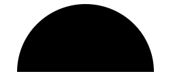
裁剪实例
html
<svg version="1.1" xmlns="http://www.w3.org/2000/svg" xmlns:xlink="http://www.w3.org/1999/xlink"  width="200" height="200">
  <defs>
    <clipPath id="cut-off-bottom">
      <rect x="0" y="0" width="200" height="100" />
    </clipPath>
  </defs>
  <circle cx="100" cy="100" r="100" clip-path="url(#cut-off-bottom)" />
</svg>
clip-path元素来表示裁剪路径。
使用 circle 定义一个半径 100 圆,使用 clip-path 定义宽 200,高 100 的 rect 元素矩形。clipPath 元素经常放在一个 defs 元素内;在 circle 元素使用 clip-path 属性引用已经定义好的 cut-off-bottom 的裁剪路径。因为裁剪路径的宽和高分别为 200 和 100,而圆的路径是 200,圆的下半部分因为没有在裁剪路径的范围内,所以圆的下半部分消失。
蒙版实例
蒙版 mask 可以指定不同位置的透明度,可以使用渐变等属性来定义蒙版
html
<svg version="1.1" xmlns="http://www.w3.org/2000/svg" xmlns:xlink="http://www.w3.org/1999/xlink">

  <defs>
    <linearGradient id="Gradient">
      <stop offset="0" stop-color="white" stop-opacity="0" />
      <stop offset="1" stop-color="white" stop-opacity="1" />
    </linearGradient>
    <mask id="Mask">
      <rect x="0" y="0" width="200" height="200" fill="url(#Gradient)"  />
    </mask>
  </defs>
  <rect x="0" y="0" width="200" height="200" fill="green" />
  <rect x="0" y="0" width="200" height="200" fill="red" mask="url(#Mask)" />
</svg>
定义一个 mask 元素,它的内容是一个单一的 rect 元素,它填充一个透明到白色的渐变。作为红色矩形继承 mark 内容的 alpha 值(透明度)的结果,所以我们看到一个从绿色到红色渐变的输出

裁剪动画
html
<svg class="visible" viewBox="0 0 1400 800">
  <title>裁剪动画</title>
  <defs>
    <clipPath id="image">
      <circle cx="110" cy="400" r="160"/>
    </clipPath>
  </defs>
  <image height='800px' width="1400px" clip-path="url(#image)" xlink:href="https://gimg2.baidu.com/image_search/src=http%3A%2F%2Flmg.jj20.com%2Fup%2Fallimg%2F1113%2F052420110515%2F200524110515-1-1200.jpg&refer=http%3A%2F%2Flmg.jj20.com&app=2002&size=f9999,10000&q=a80&n=0&g=0n&fmt=auto?sec=1671869065&t=3114e0389b86821d206a3943c13e4d5e"></image>
</svg>
图片初始化只显示一个 r = 160 的圆

怎么让它动起来?直接修改 clip-path 中圆的半径 r 就行
css
.visible:hover #image circle {
    animation: visible-clippath 1s linear forwards;
}
@keyframes visible-clippath {
    to {
      r:1364;
    }
}