 前端小册
前端小册如何使用堆栈视图
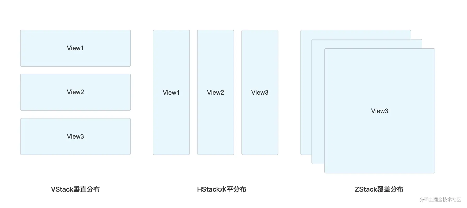
SwiftUI 里面的布局控件最常用的三种:VStack、HStack、ZStack。
VStack:视图垂直排列;
HStack:视图横向排列;
ZStack:视图覆盖排列;
它们实际使用效果如下
我们开发下面的一个小案例来加深理解
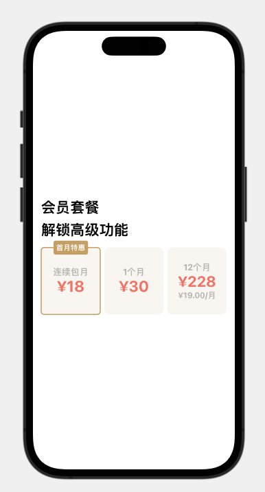
标题部分
首先创建项目 StackTest。
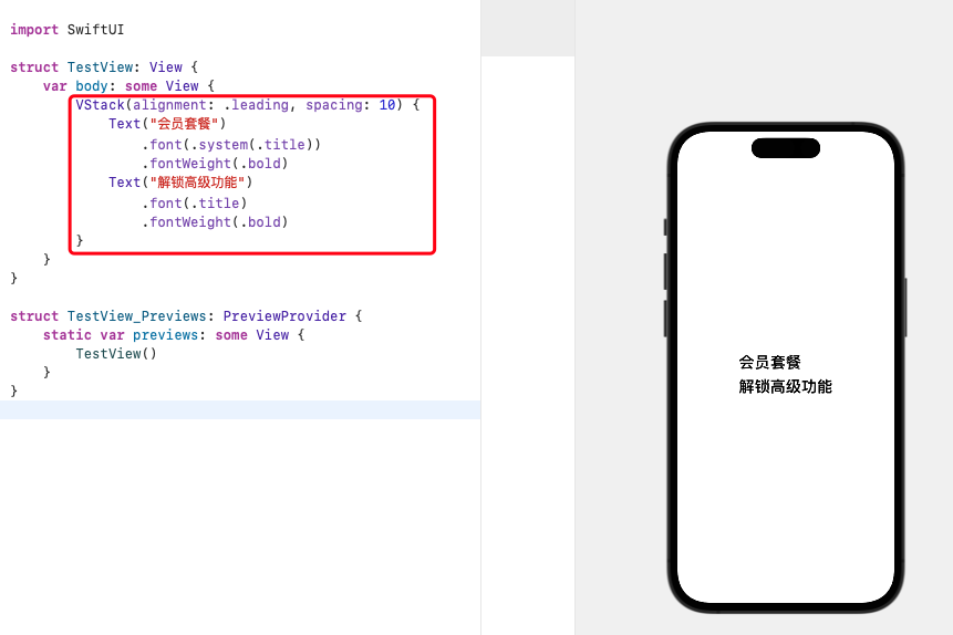
我们可以看到标题部分是由两个 Text 组成,它们是上下结构,所以使用 VStack 来包裹它们
VStack() {
    Text("会员套餐")
        .font(.system(.title))
        .fontWeight(.bold)
    Text("解锁高级功能")
        .font(.title)
        .fontWeight(.bold)
}
Stack 视图默认是居中对齐的,如果我们需要改变对齐方式,可以加入 alignment 参数;如果需要撑开点需要加入间距 spacing
| 参数 | 名称 | 描述 |
|---|---|---|
| alignment | 居中方式 | .leading左对齐,.trailing右对齐,.center居中 |
| spacing | 间距 | 间隔,组件之间的间隔距离 |
VStack(alignment: .leading, spacing: 10) {
    Text("会员套餐")
        .font(.system(.title))
        .fontWeight(.bold)
    Text("解锁高级功能")
        .font(.title)
        .fontWeight(.bold)
}
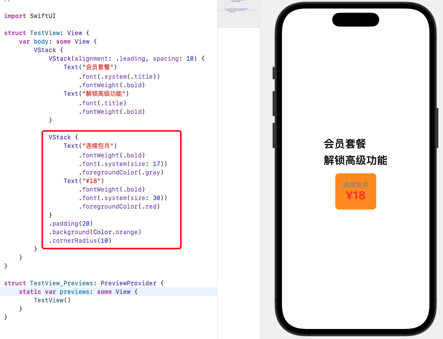
定价部分
标题部分完成!接下来我们看标题和月份选择区也是上下结构,所以我们也可以在标题部分的 VStack 上再次包裹个 VStack。
VStack {
    VStack(alignment: .leading, spacing: 10) {
        Text("会员套餐")
            .font(.system(.title))
            .fontWeight(.bold)
        Text("解锁高级功能")
            .font(.title)
            .fontWeight(.bold)
    }
}
制作定价部分,由设计知道这是三个一样的定价方案样式,我们直接做一个出来,后面复制它就行。
定价方案是由 Text(“连续包月”)、Text(“¥18”) 组成,依旧可以使用 VStack 来纵向排列
VStack {
    Text("连续包月")
        .fontWeight(.bold)
        .font(.system(size: 17))
        .foregroundColor(.gray)
    Text("¥18")
        .fontWeight(.bold)
        .font(.system(size: 30))
        .foregroundColor(.red)
}
.padding(20)
.background(Color.orange)
.cornerRadius(10)
除了设置字体,也需要修饰撑开 .padding、背景色 .background、圆角 .cornerRadius
可以看到和实际还是有点出入,这是由于没有使用设计的颜色。设置颜色的方式有2种:
一种是使用
RGB颜色值一种是在
Assets.xcassets文件中导入颜色再引用
使用 RGB 颜色值的方法
VStack {
    Text("连续包月")
        .fontWeight(.bold)
        .font(.system(size: 17))
        .foregroundColor(Color(red: 190/255, green: 188/255, blue: 184/255))
    Text("¥18")
        .fontWeight(.bold)
        .font(.system(size: 30))
        .foregroundColor(Color(red: 239/255, green: 129/255, blue: 112/255))
}
.padding(20)
.background(Color(red: 250/255, green: 247/255, blue: 243/255))
.cornerRadius(10)
导入颜色的方法就是:
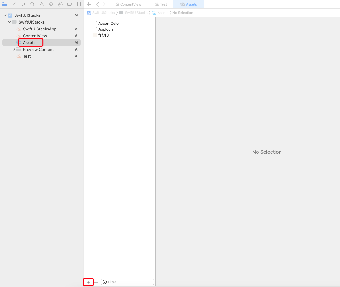
- 点击
Assets,在底部点击+按钮,选择Color set
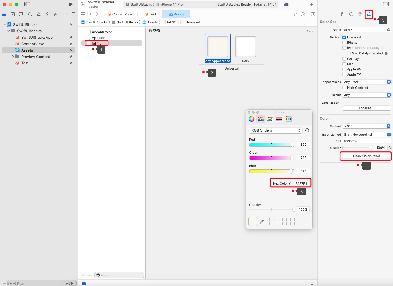
- 定义一个数值,选中
Any Appearance,这是默认的颜色,Dark为黑夜模式下的颜色,Apple 要求上架的应用必须适配黑夜模式。点击左侧顶部“设置”页,点击Color下的Show Color panel,这时会打开颜色选项弹窗。我们可以设置RGB颜色,也可以使用Hex颜色设置,这里我们设置Hex Color为faf7f3。
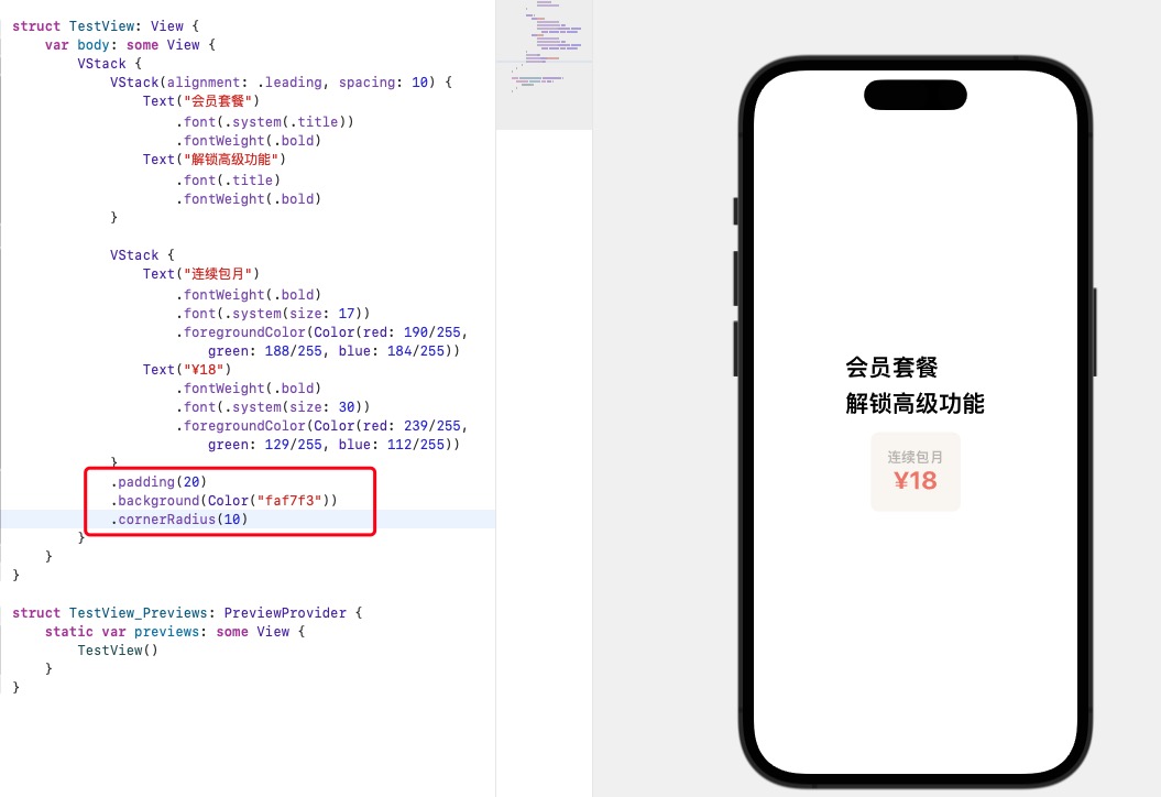
回到定价方案可以把背景色改成 Color(“faf7f3”)
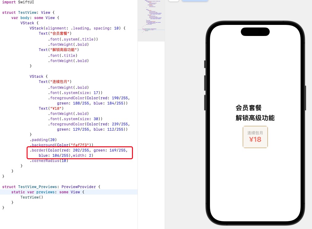
设计上定价存在一个边框样式,我们可以尝试设置 border
VStack {
    Text("连续包月")
        .fontWeight(.bold)
        .font(.system(size: 17))
        .foregroundColor(Color(red: 190/255, green: 188/255, blue: 184/255))
    Text("¥18")
        .fontWeight(.bold)
        .font(.system(size: 30))
        .foregroundColor(Color(red: 239/255, green: 129/255, blue: 112/255))
}
.padding(20)
.background(Color("faf7f3"))
.border(Color(red: 202/255, green: 169/255, blue: 106/255),width: 2)
.cornerRadius(10)
但是实际上会出现问题的,因为 SwiftUI 默认为 maskToBounds,所以这种方式设置的圆角会被裁剪一部分。
所以需要改成
// 定价方案

VStack {
    Text("连续包月")
        .fontWeight(.bold)
        .font(.system(size: 17))
        .foregroundColor(Color(red: 190 / 255, green: 188 / 255, blue: 184 / 255))
    Text("¥18")
        .fontWeight(.bold)
        .font(.system(size: 30))
        .foregroundColor(Color(red: 239 / 255, green: 129 / 255, blue: 112 / 255))
    }
    .padding(20)
    .background(Color("faf7f3"))
    .overlay(RoundedRectangle(cornerRadius: 6).stroke(Color(red: 202 / 255, green: 169 / 255, blue: 106 / 255), lineWidth: 2))
}
.overlay(RoundedRectangle(cornerRadius: 6).stroke(Color(red: 202 / 255, green: 169 / 255, blue: 106 / 255), lineWidth: 2))
这一句代码的含义是:给这个视图加一个圆角,再给圆角描个有颜色的线框。
RoundedRectangle():圆角矩形
cornerRadius:圆角度数
stroke:描边
Color:颜色
lineWidth:线度
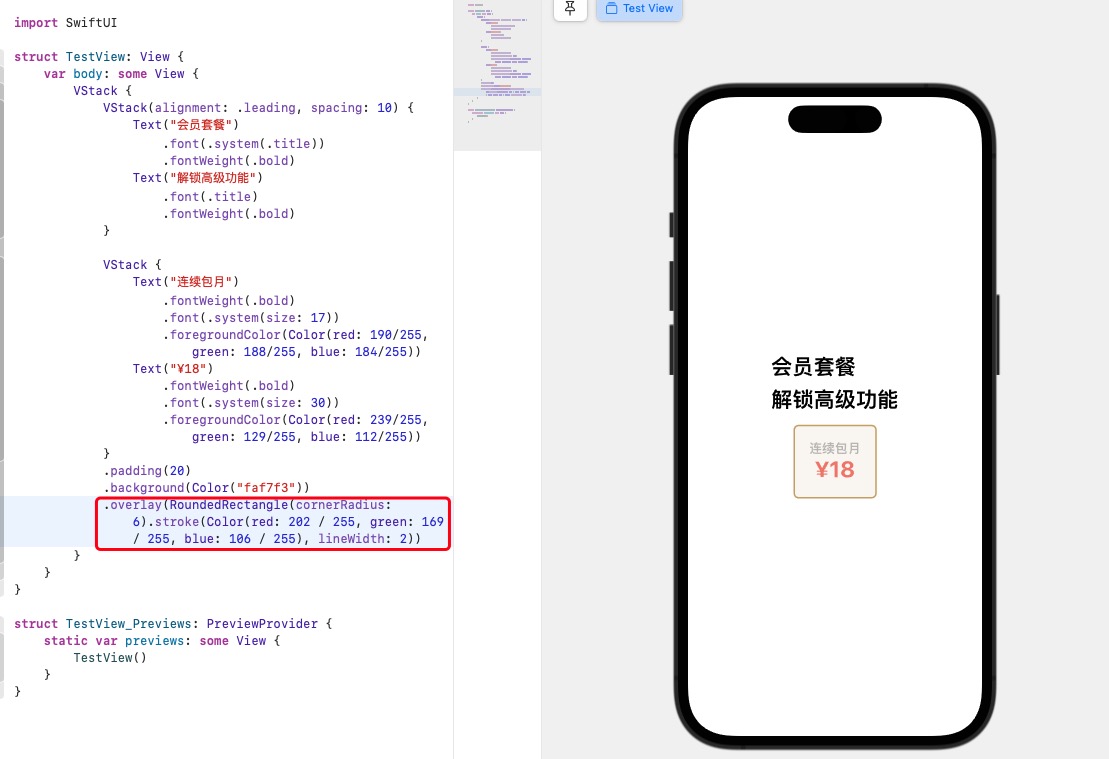
第一个定价方案已经完成。
完善定价
看到设计,存在三个同样的定价样式,它们是横向排列,所以可以使用 HStack 包裹它们;复制第一个定价方案,修改文字和去掉不用的边框。
选中 VStack,按住 command,点击面板,插入 HStack
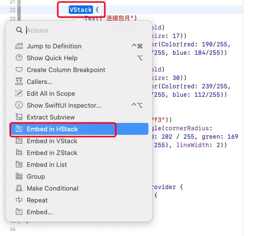
查看代码
HStack {
    VStack {
        Text("连续包月")
            .fontWeight(.bold)
            .font(.system(size: 17))
            .foregroundColor(Color(red: 190/255, green: 188/255, blue: 184/255))
        Text("¥18")
            .fontWeight(.bold)
            .font(.system(size: 30))
            .foregroundColor(Color(red: 239/255, green: 129/255, blue: 112/255))
    }
    .padding(20)
    .background(Color("faf7f3"))
    .overlay(RoundedRectangle(cornerRadius: 6).stroke(Color(red: 202 / 255, green: 169 / 255, blue: 106 / 255), lineWidth: 2))

    VStack {
        Text("1个月")
            .fontWeight(.bold)
            .font(.system(size: 17))
            .foregroundColor(Color(red: 190/255, green: 188/255, blue: 184/255))
        Text("¥30")
            .fontWeight(.bold)
            .font(.system(size: 30))
            .foregroundColor(Color(red: 239/255, green: 129/255, blue: 112/255))
    }
    .padding(20)
    .background(Color("faf7f3"))
    .cornerRadius(6)

    VStack {
        Text("12个月")
            .fontWeight(.bold)
            .font(.system(size: 17))
            .foregroundColor(Color(red: 190/255, green: 188/255, blue: 184/255))
        Text("¥228")
            .fontWeight(.bold)
            .font(.system(size: 30))
            .foregroundColor(Color(red: 239/255, green: 129/255, blue: 112/255))
        Text("¥19.00/月")
            .fontWeight(.bold)
            .font(.system(size: 17))
            .foregroundColor(Color(red: 190/255, green: 188/255, blue: 184/255))
    }
    .padding(20)
    .background(Color("faf7f3"))
    .cornerRadius(6)
}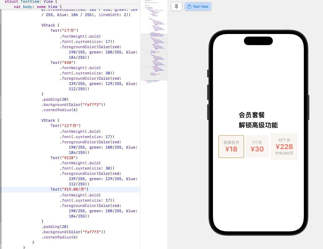
我们看到实际上高度不一样了,需要让三个方案一致,需要引入 .frame 修饰;它允许用户定义视图的大小,无论内部元素怎么变化,视图都可以维持固定的大小。
VStack {
    Text("12个月")
        .fontWeight(.bold)
        .font(.system(size: 17))
        .foregroundColor(Color(red: 190/255, green: 188/255, blue: 184/255))
    Text("¥228")
        .fontWeight(.bold)
        .font(.system(size: 30))
        .foregroundColor(Color(red: 239/255, green: 129/255, blue: 112/255))
    Text("¥19.00/月")
        .fontWeight(.bold)
        .font(.system(size: 17))
        .foregroundColor(Color(red: 190/255, green: 188/255, blue: 184/255))
}
.frame(minWidth: 0, maxWidth: .infinity, minHeight: 90)
.padding(20)
.background(Color("faf7f3"))
.cornerRadius(6)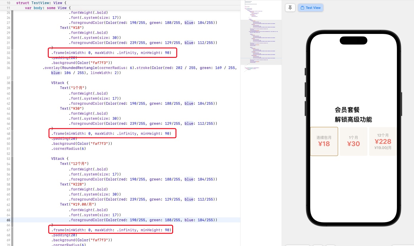
.frame(minWidth: 0, maxWidth: .infinity, minHeight: 90) 设置最小高度固定都是90,最小宽度为0,最大宽度就按照屏幕宽度平分。
看到两边需要留点空间,需要对整个 HStack 设置 .padding 。
HStack {
    //...
}
.padding(.horizontal)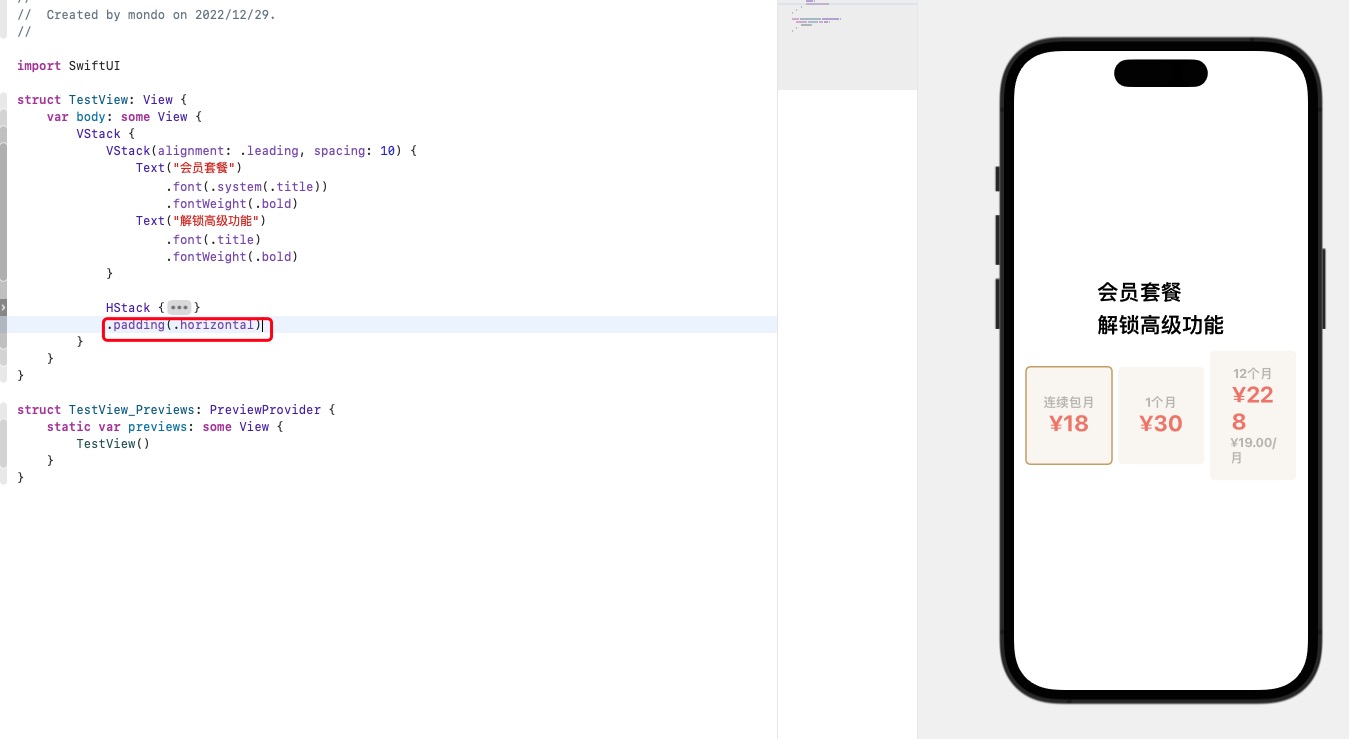
可以看到最后一个定价的字体被挤下来了,这里可以使用 .minimumScaleFactor 和 .lineLimit 修饰符修饰
minimumScaleFactor:缩小字体大小以使文本适合可用空间的最小允许比例lineLimit:文字行数
VStack {
    Text("12个月")
        .fontWeight(.bold)
        .font(.system(size: 17))
        .foregroundColor(Color(red: 190/255, green: 188/255, blue: 184/255))
    Text("¥228")
        .fontWeight(.bold)
        .font(.system(size: 30))
        .minimumScaleFactor(0.7)
        .lineLimit(1)
        .foregroundColor(Color(red: 239/255, green: 129/255, blue: 112/255))
    Text("¥19.00/月")
        .fontWeight(.bold)
        .font(.system(size: 17))
        .minimumScaleFactor(0.7)
        .lineLimit(1)
        .foregroundColor(Color(red: 190/255, green: 188/255, blue: 184/255))
}
.frame(minWidth: 0, maxWidth: .infinity, minHeight: 90)
.padding(20)
.background(Color("faf7f3"))
.cornerRadius(6)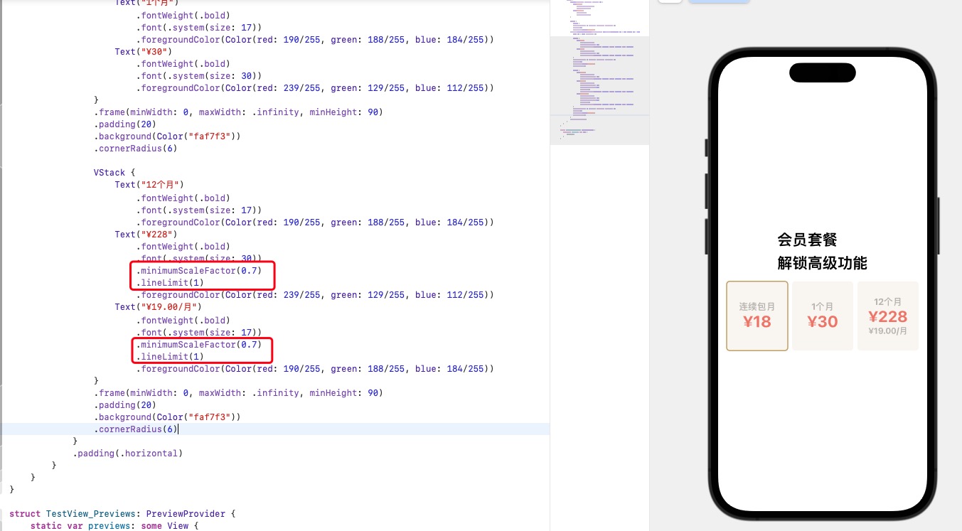
定位
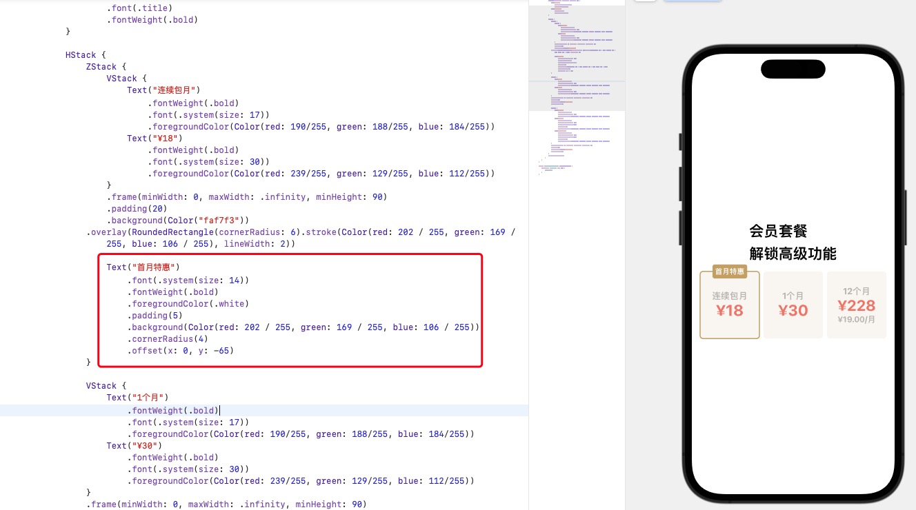
第一个定价方案的顶部有个“首月特惠”,它是覆盖在视图上面而且覆盖了一半。
找到第一个定价,在 VStack 上包裹 ZStack,完善”首月特惠“的代码;调整文本的位置,使用 .offset 修饰符,它设置偏移量;简单来说,就是修饰被选定的视图,应该移动到哪里。
X,Y 分别对应坐标轴位置,X 轴正数为右移,负数为左移,Y 轴正数下移,负数上移。
ZStack {
    VStack {
        // ...
    }

    Text("首月特惠")
        .font(.system(size: 14))
        .fontWeight(.bold)
        .foregroundColor(.white)
        .padding(5)
        .background(Color(red: 202 / 255, green: 169 / 255, blue: 106 / 255))
        .cornerRadius(4)
        .offset(x: 0, y: -65)
}
完善代码
对照设计,标题内容是左对齐的,但现在仍是居中对齐,我们希望整个文字和定价方案是左对齐,需要引入一个新的参数,叫做 Spacer()。
Spacer() 相当于空白视图,什么都没有,但可以在 Stack 中充当“挤开”其他视图的作用。
标题部分和 Spacer() 是横向排列,需要把整个标题包裹在一个 HStack 里
HStack {
    VStack(alignment: .leading, spacing: 10) {
        Text("会员套餐")
            .font(.system(.title))
            .fontWeight(.bold)
        Text("解锁高级功能")
            .font(.title)
            .fontWeight(.bold)
    }

    // 间隔
    Spacer()
}
.padding()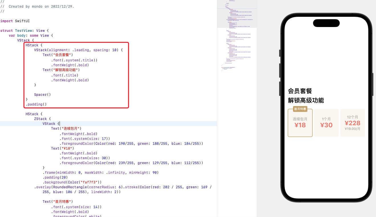
最终我们就完成了整个视图的开发。
总结
最后,我们总结下用到的一些修饰符
整体布局使用 VStack、HStack、ZStack 来包裹
设置字体颜色,大小
设置边框
.stroke与圆角.cornerRadius
.overlay(RoundedRectangle(cornerRadius: 6).stroke(Color(red: 202 / 255, green: 169 / 255, blue: 106 / 255), lineWidth: 2))- 文字最小行数
Text("¥19.00/月")
    // ...
    .minimumScaleFactor(0.7)
.lineLimit(1)- 定位
offset
ZStack {
    Text("首月特惠")
        .font(.system(size: 14))
        .fontWeight(.bold)
        .foregroundColor(.white)
        .padding(5)
        .background(Color(red: 202 / 255, green: 169 / 255, blue: 106 / 255))
        .cornerRadius(4)
        .offset(x: 0, y: -65)
}